We pointed out that Suttle was confused that everything didn't have to relate back to the Obama plan.But it's hard to blame Councilman Kookypants. He was in DC at the time, and probably had Obama-on-the-brain syndrome.
But then again, ALL the campaigns seem to have a little Obama in them these days. Mainly in the form of their campaign logos. Let's take a look.
***
First let's take a look at the main 2008 Obama for President logo:

There were variations on this pattern, but this seemed to be the main one put forth. The sort of sunrise coming out of the "O", with the three flag-type stripes flying by in an arc (the top part of an "O"?). So where do the Omaha Mayoral candidates come in for their versions?
***
Here is the Jim Vokal for Mayor logo:

The silhouetted city-scape with two-out of three Obama stripes flying by in the arc. Making an Omaha "O" (or an Obama "O")?
How does that compare directly to the Obama logo?

We give it two "Yes We Can!"s.
***
Next is the Jim Suttle for Mayor logo:
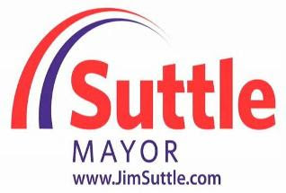
Of the three candidates, Suttle is clearly trying the hardest to be Omaha's Obamaniac. He's hoping to suck in all of their vols. He is tying everything he can (as noted above) to the new President. And he's working that logo.
 We give it three "Yes We Can!"s.
A couple other things about the Suttle logos. We were perusing his website, and came upon this click-able image:
 And then we thought...Where have we seen that before? Hmmmm...
Oh yeah:

And then there's Suttle's website itself. When he started out, the site had the look of a 1998 website, based on the graphics. We kidded the camp, and questioned why they didn't just let the Secret Penguins guys re-do the entire site, like they did for the little extra page they've done for Suttle.
Then a few days later, Camp Suttle re-did the entire homepage, with the over-exuberant flag waving crowd. And we thought, there's no way this patriotic gang are a bunch of Suttle-supporting Omahans, right?
 Chuckle.
Well, L. St. reader OmaSteak pointed out, the Suttle campaign simply used "Template #19937" offered by BigWebmaster.com.
Chuckle.***
Finally there's the Hal Daub for Mayor logo.
 Daub chose to go with only one Obamaha flying stripe, and we give the final Obamaization of the Daub logo just one "Yes We Can!".
 But we found another strange factor in the Daub logo. As many of the campaigns do, there are variations on the Daub logo -- by shades and other factors.
For instance, below we see the Daub yard sign (a plain full blue), the logo used on the Daub webpage (which adds a little "sun" in the "O" on "MAYOR", and then the logo camp Daub uses on their press-release stationery.


Finally there's the Hal Daub for Mayor logo.
Daub chose to go with only one Obamaha flying stripe, and we give the final Obamaization of the Daub logo just one "Yes We Can!".But we found another strange factor in the Daub logo. As many of the campaigns do, there are variations on the Daub logo -- by shades and other factors.For instance, below we see the Daub yard sign (a plain full blue), the logo used on the Daub webpage (which adds a little "sun" in the "O" on "MAYOR", and then the logo camp Daub uses on their press-release stationery.
Now notice the background used on that final one? Sort of a sun's rays kind of thing, right? So we thought, Where have we seen that before?
And it came to us.
 Doubtful that the Daub campaign is trying to compare itself to the Empire of Japan, but an interesting logo choice, nonetheless.
And it came to us.
Doubtful that the Daub campaign is trying to compare itself to the Empire of Japan, but an interesting logo choice, nonetheless.**UPDATE (already)**
A commenter wanted to compare Daub's current logo, to the one he used in his brief 2007 Senate run and we found this from one of his ads (and compare to his current logo):

You can see that back in 2007 Daub used the red underline as well. Of course it's up to you how much influence Barack Obama has on Hal Daub. (Hence, only the one Y.W.C. from L. St...)
**UPDATE at 3:19**
A commenter has pointed us to the McCain yardsign design for the basis of the Daub sunburst background on their logo (though note that the background of the actual Daub's yardsign is plain blue).

So there you go, L. St. readers: Daub campaign design team's inspiration is John McCain. Not Tojo. We stand corrrected.
Sort of...
***
Any other design items we missed? See a freaky yardsign? Send us your designs and camera-phone shots and we'll see what's good out there.
***
And today is the deadline to file for Omaha City Council. We will take a look at all the contenders soon.
Any other design items we missed? See a freaky yardsign? Send us your designs and camera-phone shots and we'll see what's good out there.
***
And today is the deadline to file for Omaha City Council. We will take a look at all the contenders soon.


38 comments:
Too bad in 2007, when Hal ran he had nearly the same line in his ad and on his shirts and his logos.
SS, you might want to run a comparison of Hal Daub's website with BarackObama.com Quite a few similarities there.
These candidates seem to put a lot of effort into their campaign websites but I wonder why they never seem to put the URL on their campaign signs? Just curious.
Here's what common sense has been telling the rest of us besides Street Sweeper:
Vokal's logo is the only one that resembles the Obama logo. It is a partial rip-off.
It's a stretch to say the same about Daub's and Suttle's logos, which no one been comparing to Obama's logo until now. Street Sweeper is doing so here in order to dilute the impact of a negative topic for Vokal.
Anon 11:02 -- Daub's signs have URLs. Look in the white space at the bottom.
When there's no good news for Vokal, there's no news on Leavenworth Street Blog.
Return the tainted fire union money, Jim.
Very colorful post, Street Sweeper, but not a lot of substance today.
Sweeper has very little substance anymore.
While Sweeper did use some of the info from a deleted post on Suttle using a licensed template for his website, he forgot to include Suttle's campaign opted for the nonexclusive $65 license instead of the $2400 exclusive, sole use license. Suttle being cheap. already spent too much on website development or just low on funds???
PS - I've only seen one Vokal sign so far...zero from any other campaign.
Wow, you are a bitter, humorless bunch today. I feel sorry for your dogs.
(And thanks again to OmaSteak for the link and the additional info.
-SS)
SS, you should be ashamed of yourself. I cannot believe you would stoop to the level of planting the seed in peoples' minds that somehow Hal Daub's campaign would be connected in any way to the the Japanese empire.
Yes, I am a Daub supporter, and proud of it. So people can say what they want. But I do find it interesting that you seem to always get a dig in to Hal no matter what the subject is.
I planted the seed??? They're the ones that chose to put a rising sun on their logo!
Here, let me categorically state that I don't think the Daub campaign had/has anything to do with the rise of Tojo, bombing Pearl Harbor or that crappy movie, "Rising Sun".
But I think it was a weird choice by their logo designer.
A fourth candidate filed for Mayor today, Randy Brown. Other than being a republican and a little quote on wowt's site, not much info on him
We have been outed, Hal was behind Pearl Harbor!!!! We would have gotten away with it if it wasn't for those medeling Bloggers.
Anon 11:36 hit the nail on the head for me:
"But I do find it interesting that you seem to always get a dig in to Hal no matter what the subject is."
No, you're right:
Of the three different logos the Daub camp has out, we should have ignored the one with the Rising Sun background, and instead simply said, "My what a creative design that we've never seen anywhere before."
That way you wouldn't be so upset right now...
Explain to me again how Hal Daub's logo looks anything like Barack Obama's?
...to anyone except someone trying to make a tortured argument that Vokal's logo is really not any more of a rip off than his competitors.
Sweeper...you could have just left Daub and Suttle out of it and made a simple point about Jim Vokal.
You can't bring yourself to post an entry that would result in a net loss for Vokal & McGrain, though -- even on such a trivial matter as this.
Yet you can't appear _totally_ in the tank for Vokal. So you periodically post pieces like this one, which appear to take a swipe at Vokal, but end up
- diluting potential negative press
and/or
- trying to make one of the other candidates look worse
Just because some of your readers are observant enough to notice this doesn't mean that they are "bitter" or "humorless."
Yeah, I'm not seeing it either for Suttle's OR Daub's logos. The only one that looks like Obama's logo is Jim Vokal's.
No, you're clearly humorless. And as far as your anger goes, I see it as based on the fact that we're not constantly singing the praise of your candidate and knocking everyone else. That's it, and while I can understand why you can't see it, it doesn't make it any less true.
And I'll work on explaining this post, if it helps you.
We've been looking at the campaign logos for a while now. If you can't see the similarity of the streaking stripe in all three designs, then you should get your eyes checked.
With that, one can look at the Obama logo for similarities as well.
Now, we could have said, "this looks similar and that looks similar", but it's really in the eye of the beholder right? (I think your comments have PROVEN that.)
So what did we do? We put the freaking designs right next to each other to look at. We couldn't have been more up front and impartial in how we did it.
Now, let's argue the other way, just for the sake of it.
Let's say, first, that we thought Vokal's looked the most like Obamas and the other two don't at all.
So we leave out Suttle from the "looks like Obama's" discussion. Well anyone looking at it will say, "wait a minute, Suttle is doing the same thing with his arcing stripes, and he even has arguably more incentive to do it (hoping to attract Obama Dems to his camp)."
OK, so instead we discuss Vokal AND Suttle, leaving out Daub. Then looking at it one argues, "Daub's doesn't arc like Vokal's and Suttle's, but it's the same color stripe, and it is arced." Now if Daub doesn't have the red, streaking arc in the logo, then he's not in the discussion. But he does, so you do.
So how can you NOT add that to the discussion? Well, if you want to have a fair and logical discussion, you can't. So instead you show them all, similarities or not, and you let readers judge.
Now as far as the rest of the stuff goes, we just threw that in. The Suttle logo link with the downtown silhouette? Are we "reaching" on that too?
And I've spelled it out on the Daub Rising Sun, but I'll just say if you ignore that, then what's the point of discussing anything.
Now if you think we somehow went "easy" on Vokal (which you SURELY do), please do tell what's interesting or noteworthy about his logo or something else that we missed on his site.
But does Vokal's logo like it has Obama's stripes in it? Well, yeah, and that's why we CONNECTED THE TWO LOGOS. Or did you miss that? Listed first.
Now the fact that instead of smiling and saying, "hmm, interesting post" you instead give your Pavlovian bark of "Vokal blog!!!", makes you...angry humorless.
Thus endeth the lesson.
Um, yikes. Can we all say together, "Jumped the shark!"
But if you're really looking for the connections, they're everywhere.
Vokal's logo is a pretty clear ripoff of Obama's. Suttle is trying to get the Democrats excited by invoking Obama's name. And Hal Daub's website is remarkably similar to Barack Obama's website.
But you went the logo route for all three of them, so it looked weak.
All we're asking is for a better effort.
Wasn't Hal's first wife Japanese? That would explain the connection...
No, Cindy Daub is Korean.
1. Sweeper has too much free time.
2. Daub stole the sun rays in the background from a variation on the McCain logo. Considering that Daub was McCain's Nebraska Chairman, that seems a little more logical, now doesn't it?
http://i.ehow.com/images/GlobalPhoto/Articles/4502458/McCainPalinYardSign-main_Full.jpg
1. Ha.
2. Now THAT's some interesting info, that is actually helpful to the discussion.
We'll update.
Though whoever designed Daub's sunburst should have mimicked McCain's more...
Just so we're all clear - this is Street Sweeper's blog. He/She posts thoughts and opinions and then says, "React." You all react like this is supposed to be the height of journalism. Stop boring us with your "SS is biased" blurbs. Please disagree all you want, but make an argument. Personally I'm thankful for an entertaining forum. Now - I'm sure you'll all react as to why SS shouldn't be biased, so . . . .
"aligner", you're hired as Press Flak. You'll be paid in L. St. collectible coins. Via email.
Note that we've updated the post with the McCain logo comparison.
Does Daub's McCain inspiration warrant negative "Yes We Can!"s?
Just like Lee Terry jumped on Obama's back to garner the North Omaha vote through Channel 22, Jim Vokal is jumping on Frank Brown's back to grab the North O vote. I am still mystified how a 501(C)(3)(Channel 22) can get away with politicizing and endorsing Vokal. I will ask the IRS to take a look at this issue if Vokal wins.
This is such a pro Street Sweeper blog.
Aligner -- Once again, the problem is not that Street Sweeper is biased. Be biased, but acknowledge it. That's all I'm asking.
And if you look back through these comments, you'll see a number of specific arguments based on content in Sweeper's post.
But Sweeper doesn't acknowledge these arguments or any topic of discussion that don't clearly and obviously benefit Jim Vokal.
I think it's okay for a reader to say that is wrong.
Why is Frank Brown supporting Vokal for Mayor? Does this indicate a lack of north Omaha support for Suttle or the strength of Vokal to pick up Democratic votes?
Frank Brown isn't going to win re-election. I wouldn't tie my cart to that horse if I were Vokal.
Either...
A) Keep $5,000 from the Fire Union in your mayoral campaign bank account.
- or -
B) Announce that your campaign will NOT take money from the Fire Union.
(Choose one.)
(Jim Vokal, I said ONE!)
I'm a life long Libertarian, ergo almost a Republican. Yet, I find myself respecting Suttle more than his opponents.
But, I despise his Logo {the one with a GREEN city under the Obama-esque curves}. I can't even think of putting that sign in My yard.
Post a Comment